For makers By Rade Kolbas17 November 20268 min read
Your websiteisn't for you.
Many makers design their website for their own taste. Here's the psychology of why that scares off the people they want, and how to design for your buyers instead.
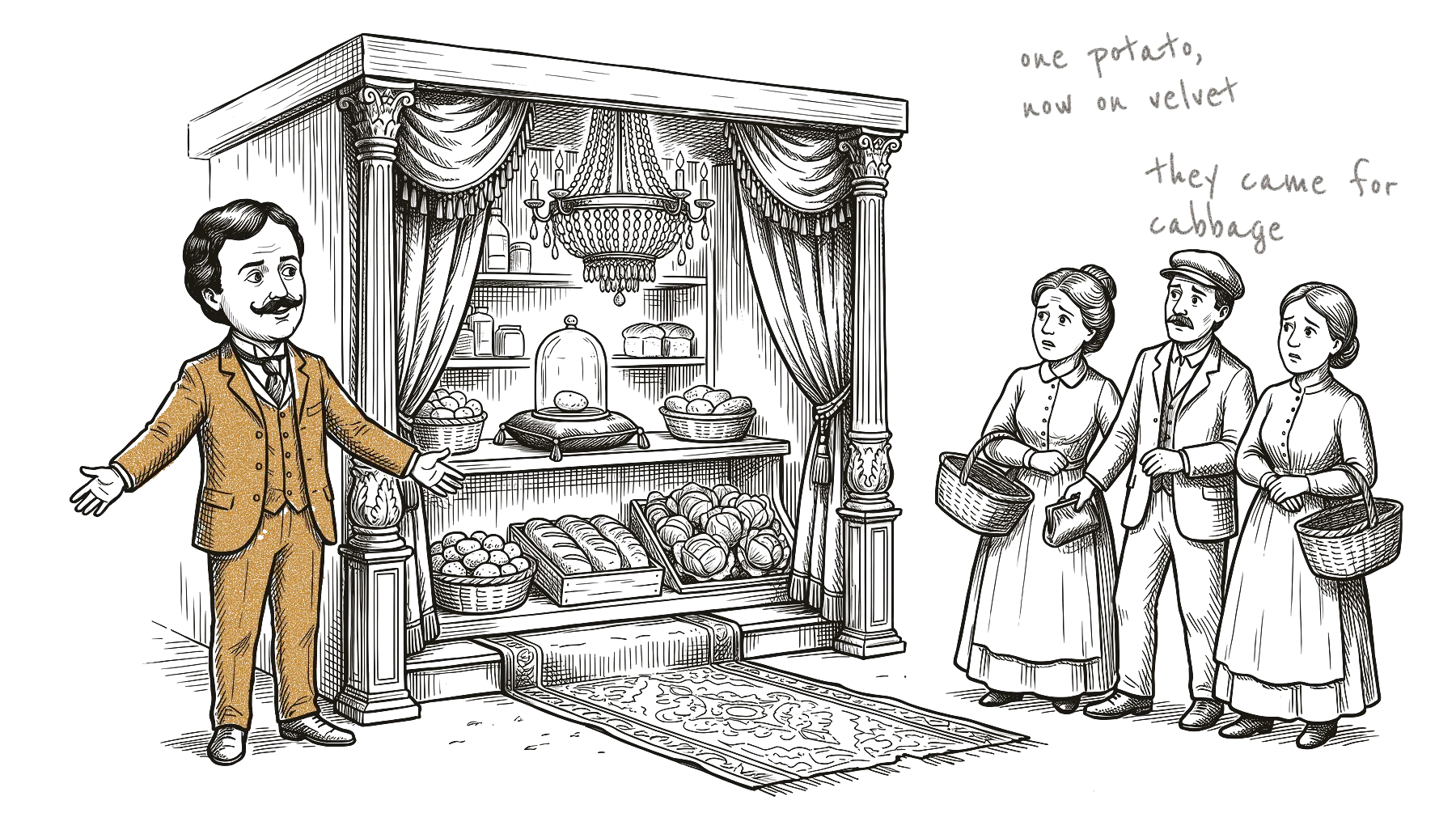
Imagine you walk into your local Aldi tomorrow morning and it looks like Gucci. Black marble floor, soft light, one bottle of olive oil on a small stone stand, a man in a suit holding the door. The people who came for milk and bread stop in the doorway. Nobody has seen a single price yet, but they already think: too expensive, not for me. Then they drive to the next supermarket.
Aldi would never do that, of course. The company says its stores are “designed with savings in mind”.
Plenty of software makers do it with their websites, though. The site gets the dark theme the maker loves, the unusual font, the animation that took a week. It looks great to the maker, while the people it was built for take one look and leave.
Running SaaSolution, a free directory of new software, I look at a lot of product websites. The design is often good, but it’s made for the maker’s taste, and the buyer rarely gets a say. Psychology research explains quite well why that costs you visitors.
People judge your page before they read it
In 2006, researchers in Canada showed people homepages for half a second and asked how good each one looked. Later they showed the same pages for just a twentieth of a second, 50 milliseconds. The ratings were very similar. Their conclusion: web designers have about 50 milliseconds to make a good first impression.
That study measured only how good a page looks, not whether people bought anything. A team at Harvard and other universities adds a second point. This first look also affects what people later think of the site: how easy it is to use, and whether they can trust it.
For your page, this means the look gets judged before a single word of your clever headline.
Simple and familiar wins
A 2012 study by researchers in Switzerland and at Google looked at what makes that first look go well. They showed people 119 real websites. Some were simple and some were busy. Some looked typical for their kind of site, and some looked unusual. “Typical” means the site looks like what people expect: a bank site looks like a bank, a shop looks like a shop.
People liked the simple, typical sites best, and the effect was already there after a very short look. Javier Bargas-Avila, one of the authors, later summed it up on Google’s research blog:
“Go for simple and familiar if you want to appeal to your users’ sense of beauty.”
Javier Bargas-Avila, Google, on the 2012 study
For your page, “typical” means typical in your buyers’ eyes. They decide what counts as normal, through the sites they already use, and your own taste plays no part in it.
Why familiar feels good
Psychologists have a name for why people like what they’ve seen before: processing fluency. When something is easy to take in, it feels a little pleasant, and people give that good feeling to the thing itself. A 2004 review lists what makes things easy to take in. Clear contrast and symmetry help, and so does looking like a typical example of its kind.
So whether something looks beautiful depends partly on the person looking. And your visitors’ eyes are used to the websites they visit every day.
You can still surprise people. A 2003 study from the Netherlands tested an idea of the industrial designer Raymond Loewy: “most advanced, yet acceptable”. People liked new designs, as long as the thing still looked like what it is.
For your page, that means one surprise on a familiar page is fine. A page made only of surprises makes the visitor work, and most visitors won’t bother.
Your design hints at your price
Back to the supermarket. Shop owners have long worried that a beautiful store makes people think the prices are high. A 2012 study from Germany tested whether that worry is real. In lab experiments, an attractive store front did make people expect higher prices. In real shops, the effect mostly disappeared. The authors’ explanation: once shoppers know the brand, or can see the prices, the look matters much less.
A small software product has the opposite problem, because nobody knows your brand yet. A stranger who lands on your homepage has almost nothing else to go on. Your design tells them who the product is for and hints at whether it’s cheap or expensive.
The same look can also mean different things for different sellers. In a 2024 study, simple, minimal packaging made people willing to pay more for food and other everyday products. For the supermarket’s own cheap brands, the effect was weaker.
I read this as: a look works when it fits what buyers already expect from that kind of seller. Minimal and expensive-looking might be right for a tool sold to design studios. For an invoicing app aimed at plumbers, it may just say “not for you”.
Experts are bad at guessing what others like
You’d think experts could guess what their audience likes. A 2001 study tested that with architects. They rated modern buildings and then predicted how ordinary people would rate them. The architects knew the public would give the buildings better marks than they did. They still couldn’t predict which buildings the public would like, because they couldn’t stop judging by their own standards.
A 2019 study found that young architects judged buildings much like everyone else. So the gap seems to open up only after years in the job. I suspect the same happens to anyone who looks at design all day: the more you’ve seen, the further your taste may drift from your buyers’.
Two well-known mental shortcuts make it worse. One is the false consensus effect: we think more people share our taste than really do. In a 1994 study, people kept doing it even after they had been told about it.
The other is the curse of knowledge: once you know something, it’s hard to imagine not knowing it. You know why your homepage has that abstract animation, but a visitor only sees something moving.
In fairness to the makers, taste helps. In the architect study, the architects who guessed best were the ones who judged buildings the way the public did. For your page, that means asking “would my buyers like this?” before “do I like this?”.
The look decides whether people trust you
In 2002, Stanford researchers asked 2,684 people to compare websites and say why one seemed more believable than the other. The look of the site came up in 46.1% of the comments, more than anything else.
Looks also change how easy people expect your product to be. A 1995 study found that people expect a good-looking screen to be easier to use, before they’ve tried it. After people really use a product, that can change again. But on your homepage, nobody has used your product yet, so that first guess is often all you get.
How to design for your buyers
You can do this without a design degree if you look at your page through your buyers’ eyes.
- Write down who it’s for, in one sentence. If you don’t have that sentence yet, start with our post on target groups.
- Look at what your buyers already know. Search on Google for the problem your product solves, in the words a buyer would type, and open the first five products that come up. If you know which tools your buyers use every day, add those. Note what these sites have in common: the colours, how much text, what’s at the top, how they show the product. Those shared features are “typical” for your buyers.
- Keep one surprise. Pick the one thing that makes you different and make it stand out. Keep the rest easy and familiar.
- Do a five-second test. Show your homepage for five seconds to two or three people from your target group, then hide it. In person, just turn the laptop away. Online, share your screen on a short video call, or send a screenshot and ask them to look at it once for five seconds. If you don’t have customers yet, ask in a forum or group where these people meet. Then ask what the product does, who it’s for, and whether it looks cheap, normal or expensive. If their answers surprise you, trust their answers over your own view.
- Put your taste in the details. The way you write, a small drawing, a friendly error message. There it can make people smile without sending them away.
Your website is a shop window for people who don’t know you yet, so arrange it for them.
Sources
- Lindgaard, Fernandes, Dudek, Brown: “Attention web designers: You have 50 milliseconds to make a good first impression!”, Behaviour & Information Technology, 2006
- Reinecke et al.: “Predicting users’ first impressions of website aesthetics with a quantification of perceived visual complexity and colorfulness”, CHI 2013
- Tuch, Presslaber, Stöcklin, Opwis, Bargas-Avila: “The role of visual complexity and prototypicality regarding first impression of websites”, International Journal of Human-Computer Studies, 2012; and Bargas-Avila, “Users love simple and familiar designs”, Google Research Blog, 29 August 2012
- Reber, Schwarz, Winkielman: “Processing Fluency and Aesthetic Pleasure”, Personality and Social Psychology Review, 2004
- Hekkert, Snelders, van Wieringen: “‘Most advanced, yet acceptable’: Typicality and novelty as joint predictors of aesthetic preference in industrial design”, British Journal of Psychology, 2003
- Zielke, Toporowski: “Negative price-image effects of appealing store architecture: Do they really exist?”, Journal of Retailing and Consumer Services, 2012
- Ton, Smith, Sevilla: “Symbolically Simple: How Simple Packaging Design Influences Willingness to Pay for Consumable Products”, Journal of Marketing, 2024
- Brown, Gifford: “Architects predict lay evaluations of large contemporary buildings: whose conceptual properties?”, Journal of Environmental Psychology, 2001
- Šafárová et al., Frontiers of Architectural Research, 2019
- Krueger, Clement: “The truly false consensus effect”, Journal of Personality and Social Psychology, 1994; Camerer, Loewenstein, Weber: “The Curse of Knowledge in Economic Settings”, Journal of Political Economy, 1989
- Fogg et al.: “How do users evaluate the credibility of Web sites?”, DUX 2003
- Kurosu, Kashimura: “Apparent usability vs. inherent usability”, CHI ‘95 Conference Companion, 1995
- Tractinsky, Katz, Ikar: “What is beautiful is usable”, Interacting with Computers, 2000
- ALDI US: “The ALDI In Store Experience”